

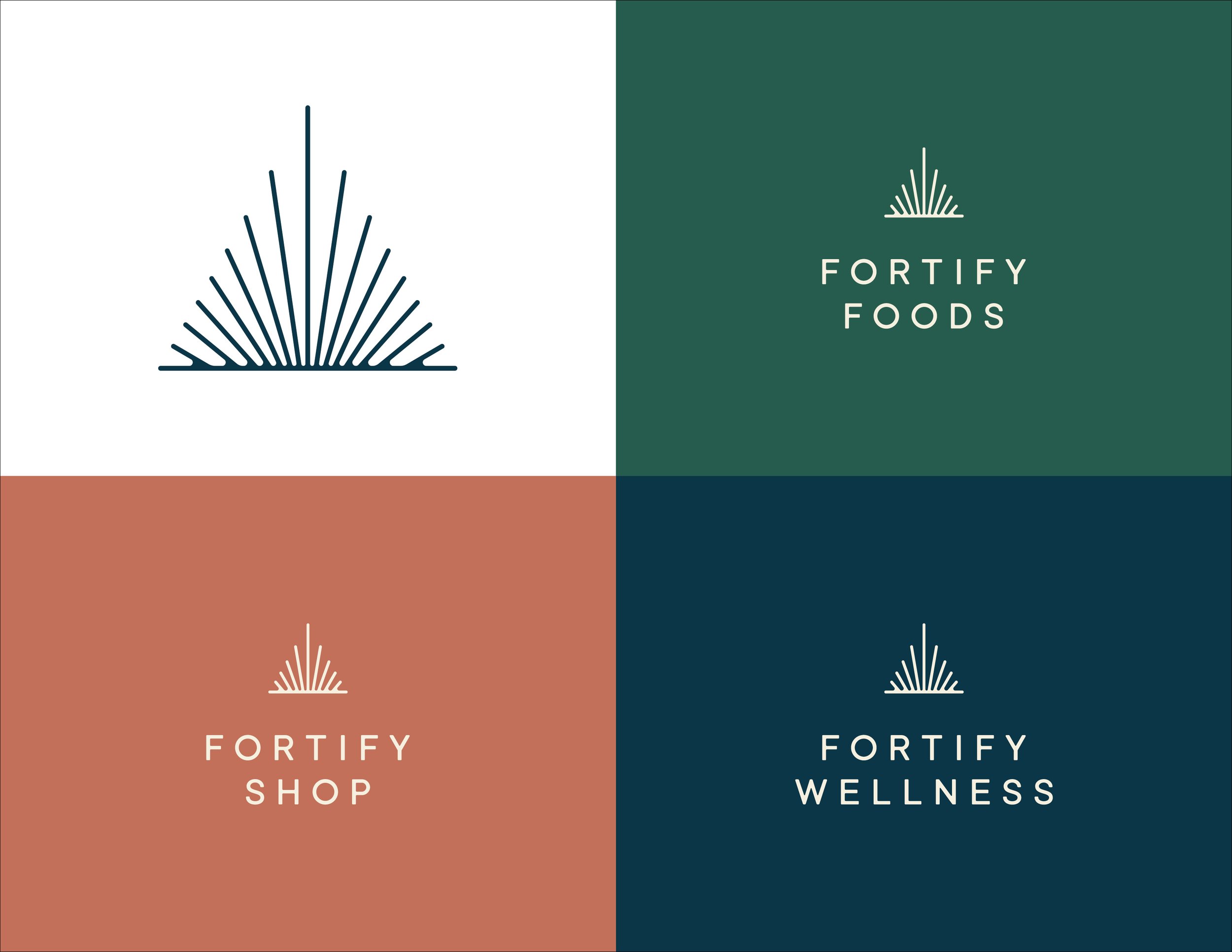
1a/11 Client: Fortify • Freelance • My Role: Lead Designer, Art Director Fortify is a wellness collective located in St Boniface. Fortify consists of three parts Fortify Foods (eatery), Fortify Shop (products and supplements) and Fortify Wellness (clinic).
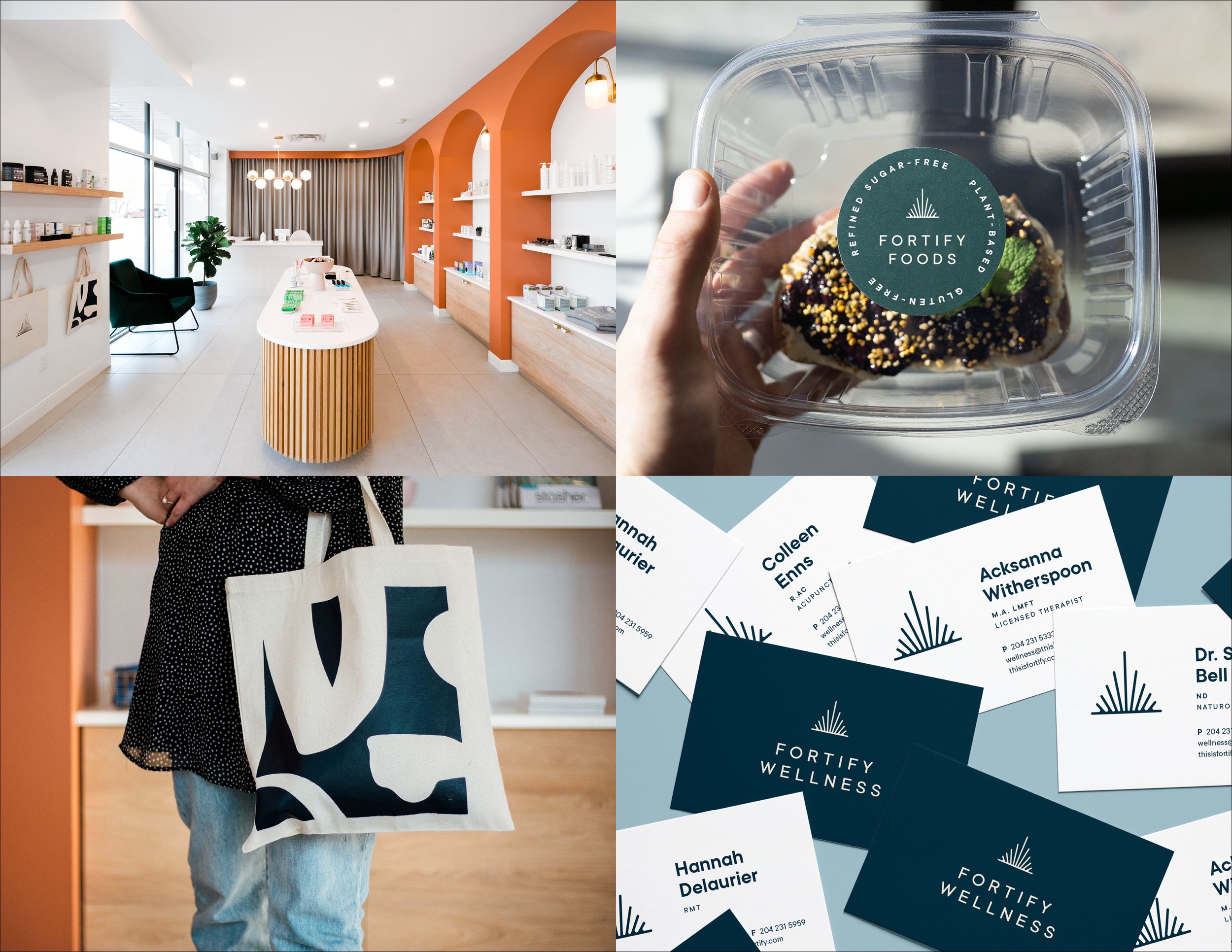
1b/11 Client: Fortify • Freelance • My Role: Lead Designer, Art Director Fortify is a wellness collective located in St Boniface. Fortify consists of three parts Fortify Foods (eatery), Fortify Shop (products and supplements) and Fortify Wellness (clinic).
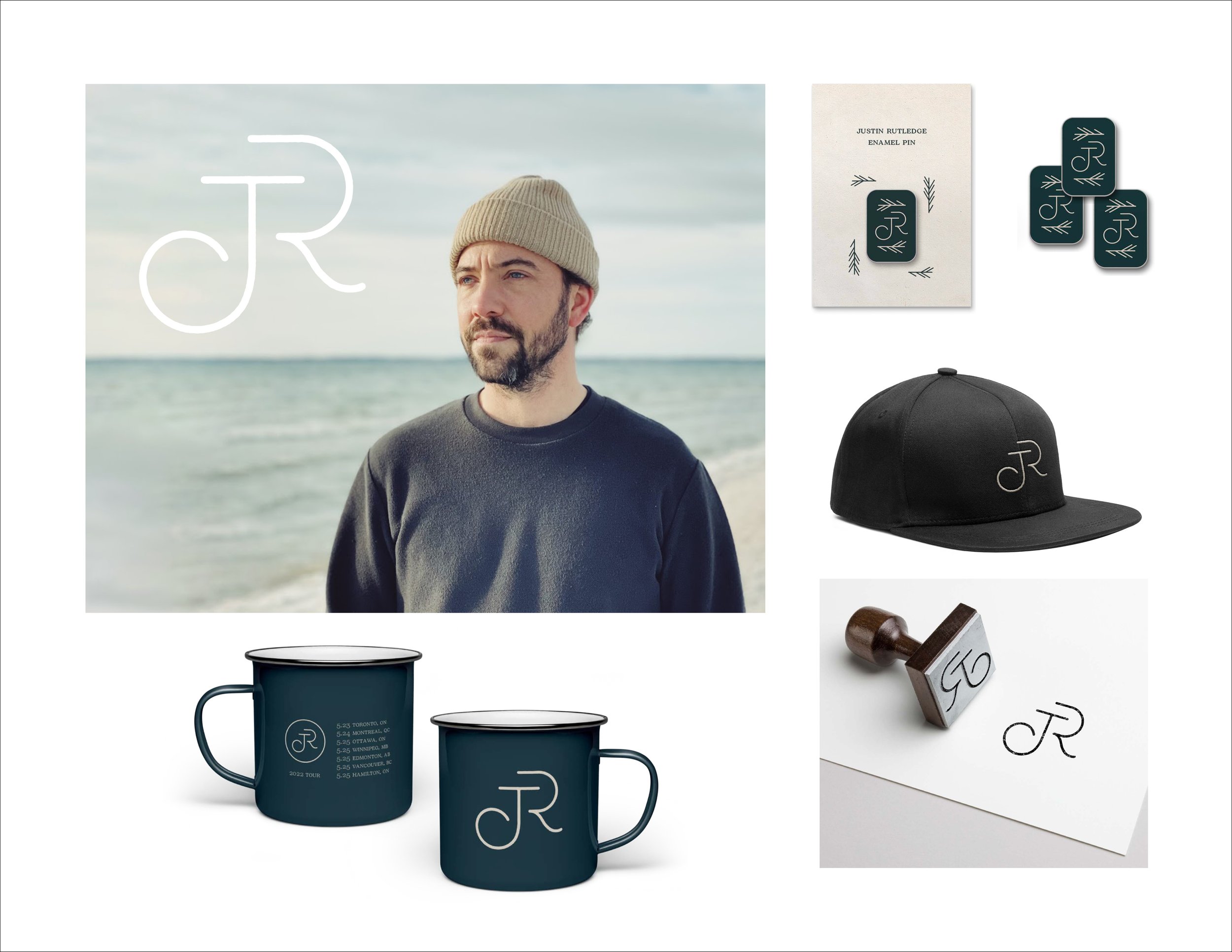
2/11 Client: Justin Rutledge (JR) • Freelance • My Role: Lead Designer, Art Director JR is an amazing singer/song writer wanting a minimal thoughtful logo to represent his serene music for merch. The logo represents quiet yet powerful melodies all organically working together to create something beautiful.
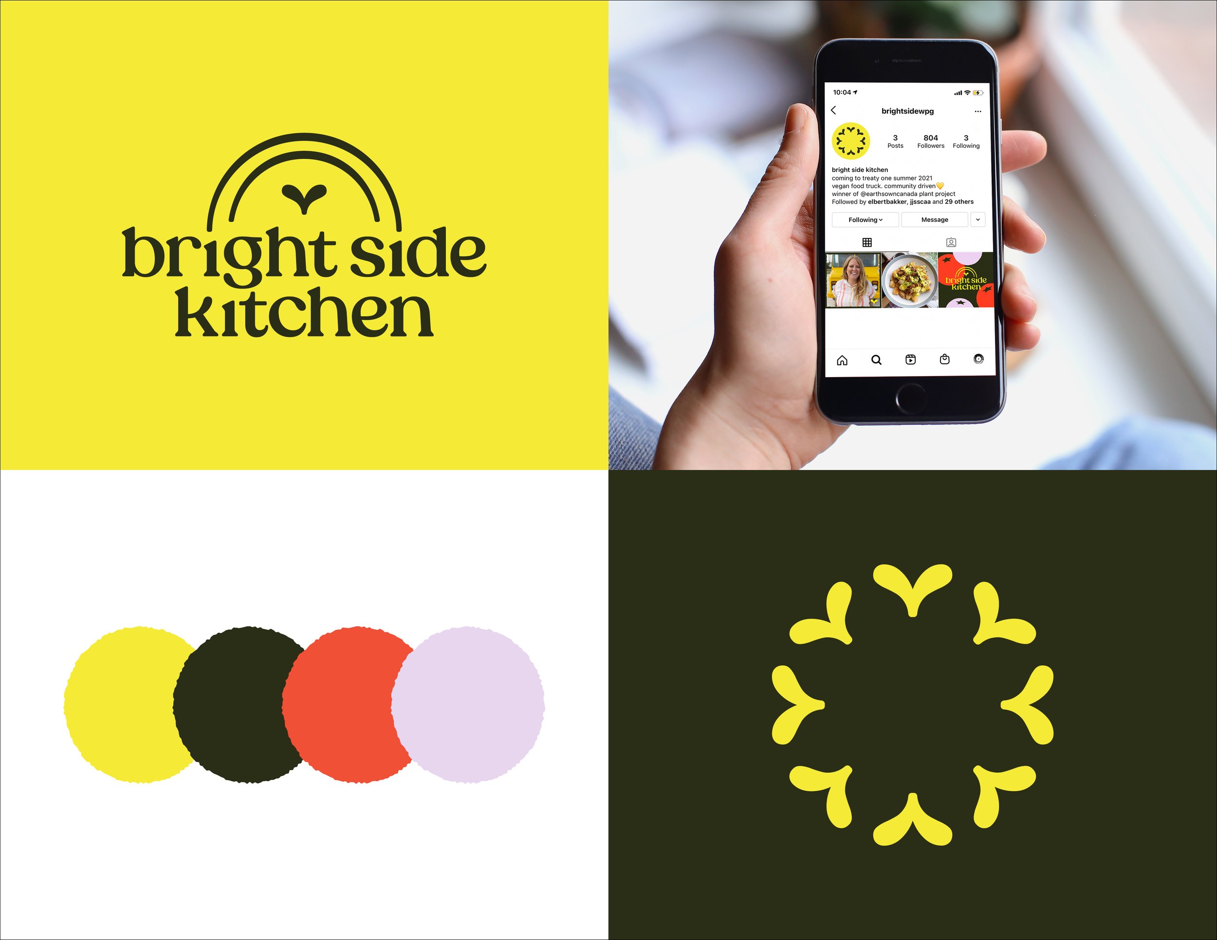
3/11 Client: Bright Side Kitchen • Freelance • My Role: Lead Designer, Art Director A vegan food truck coming to Winnipeg in 2022. Kirstie is passionate about bringing community together with food. Just wait till you see the truck!
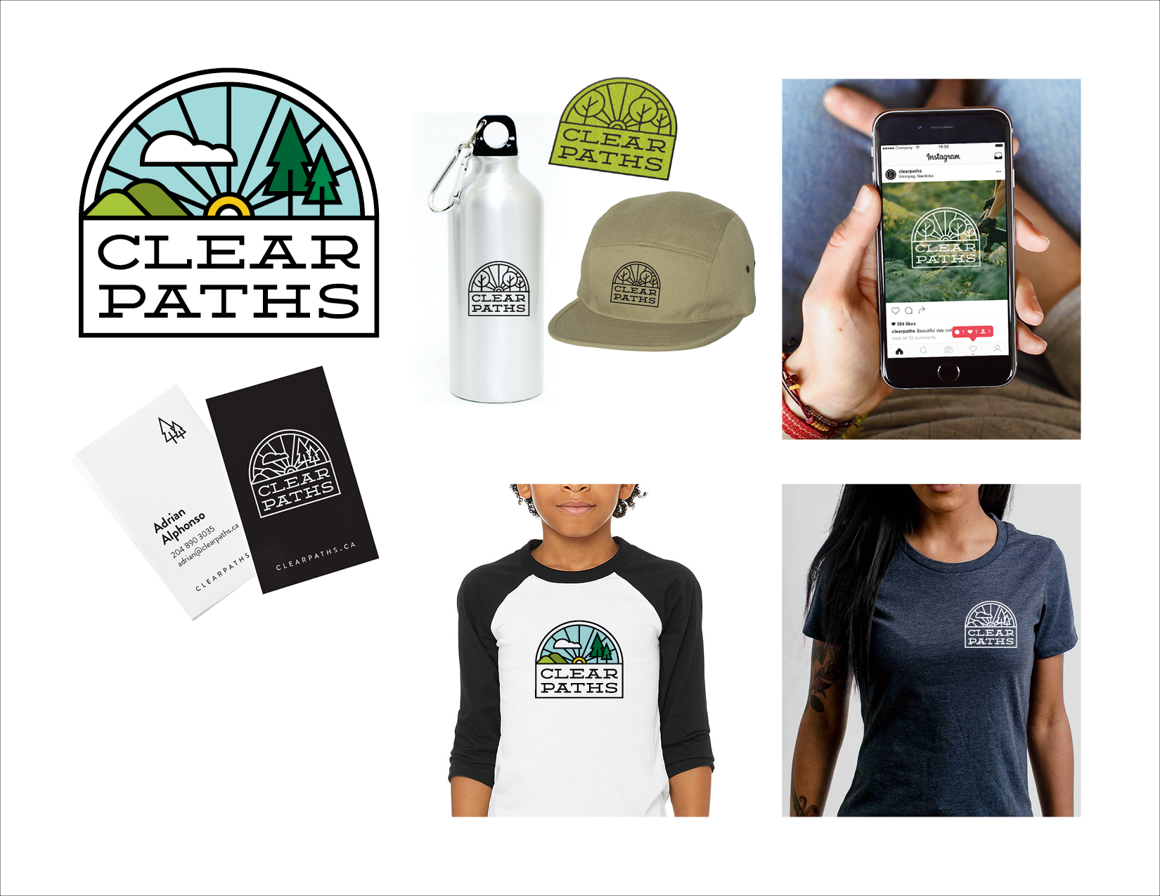
4/11 Client: Clear Paths • Agency: Tétro • My Role: Lead Designer Clear Paths is run by Adrian, his mission is to deliver inclusive, accessible cycling programs with the goal of inspiring a connection to the land. The logo was inspired by the paths, nature and a bike wheel.

5a/11 Client: Stag & Finch • Contracted by Capari • My Role: Lead Designer An e-commerce fun yet sophisticated brand directed to millenials, for engagement, bestie rings or celebrating yourself. The monogram is a subtle S & F.

5b/11 Client: Stag & Finch • Contracted by Capari • My Role: Lead Designer An e-commerce fun yet sophisticated brand directed to millenials, for engagement, bestie rings or celebrating yourself. The monogram is a subtle S & F.

6a/11 Client: The Forks • Agency: Tétro • My Role: Lead Designer The Forks is a popular gathering place for Winnipegers and Tourists, where the two rivers meet. I worked with the type lockup ‘The Forks’ that was previously designed by another designer at the agency for ‘The Forks Market’. My role was to create a pivot using the wordmark, as well as a full complimentary brand for the overall look of The Forks.
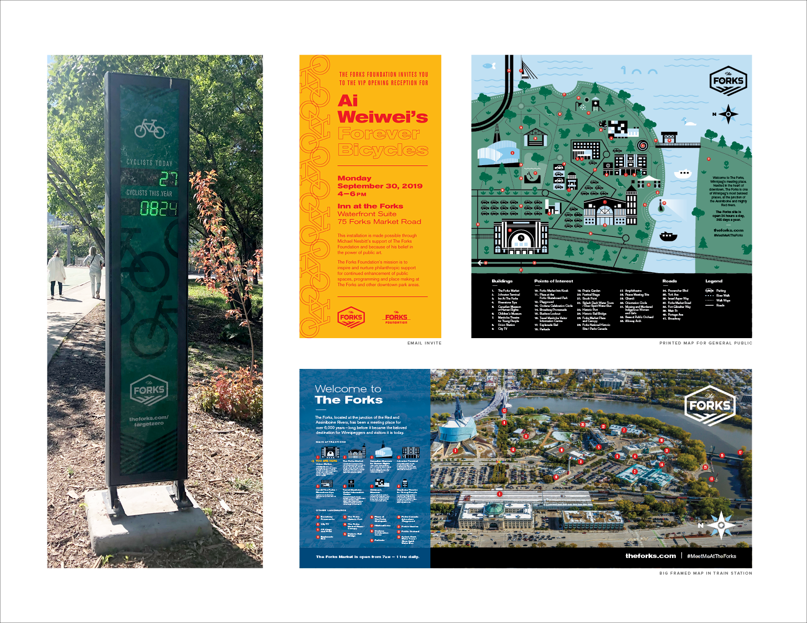
6b/11 Client: The Forks • Agency: Tétro • My Role: Lead Designer Various pieces designed for The Forks.

7/11 Client: Armstrong + Small Eyecare Centre • Agency: Tétro • My Role: Lead Designer A small local eye care centre that has been around for over a hundred years. The logo is inspired by a classic eye test chart, keeping the brand humble and small.
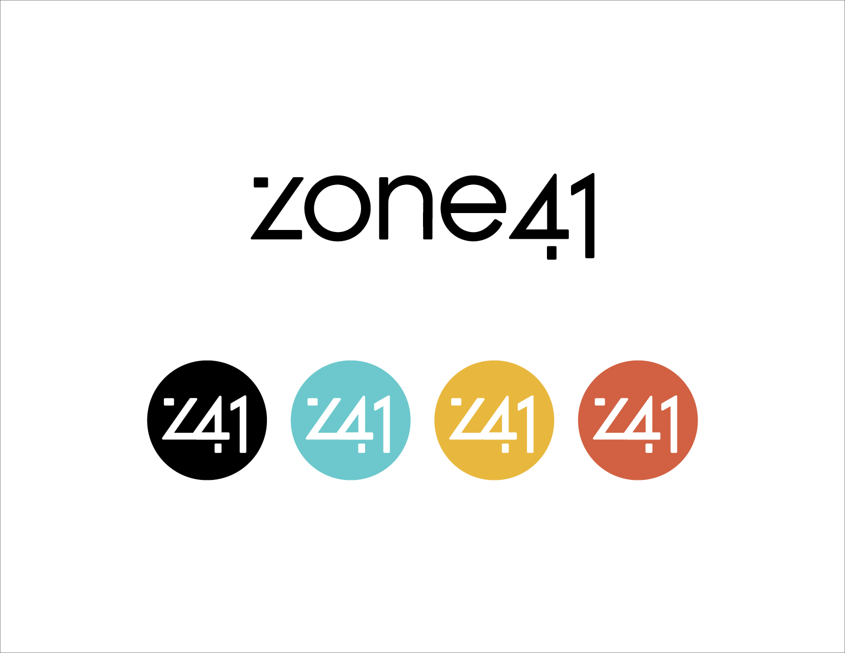
8/11 Client: Zone41 • Agency: Tétro • My Role: Lead Designer A grassroots theatre company. The client wanted a modern logo inspired by shadows that take place on the stage. The monogram of this logo is perfect for overlaying on show posters and social media.
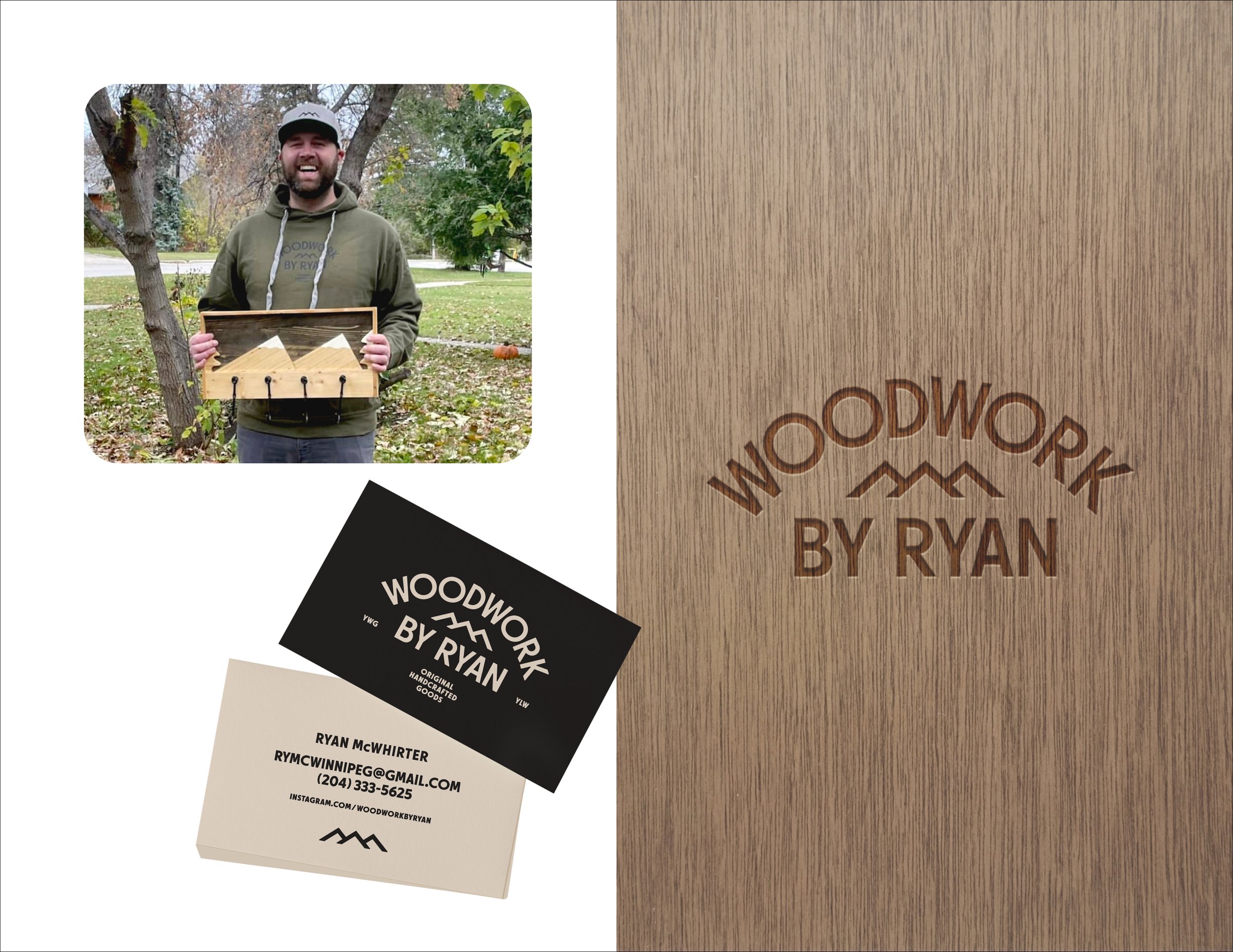
9/11 Client: Woodwork By Ryan • Freelance • My Role: Lead Designer, Art Director A Winnipeg/Kelowna woodworker was looking for a minimal friendly logo inspired by mountains, and something that would be easily branded on his creations.

10/11 Client: Akii • Freelance • My Role: Lead Designer, Art Director A dreamy earthy wellness Indigenous owned CBD company. Though I don’t think this company ever came to fruition, this was the approved branding elements and general look and feel. The logo is balanced, centered and grounding.
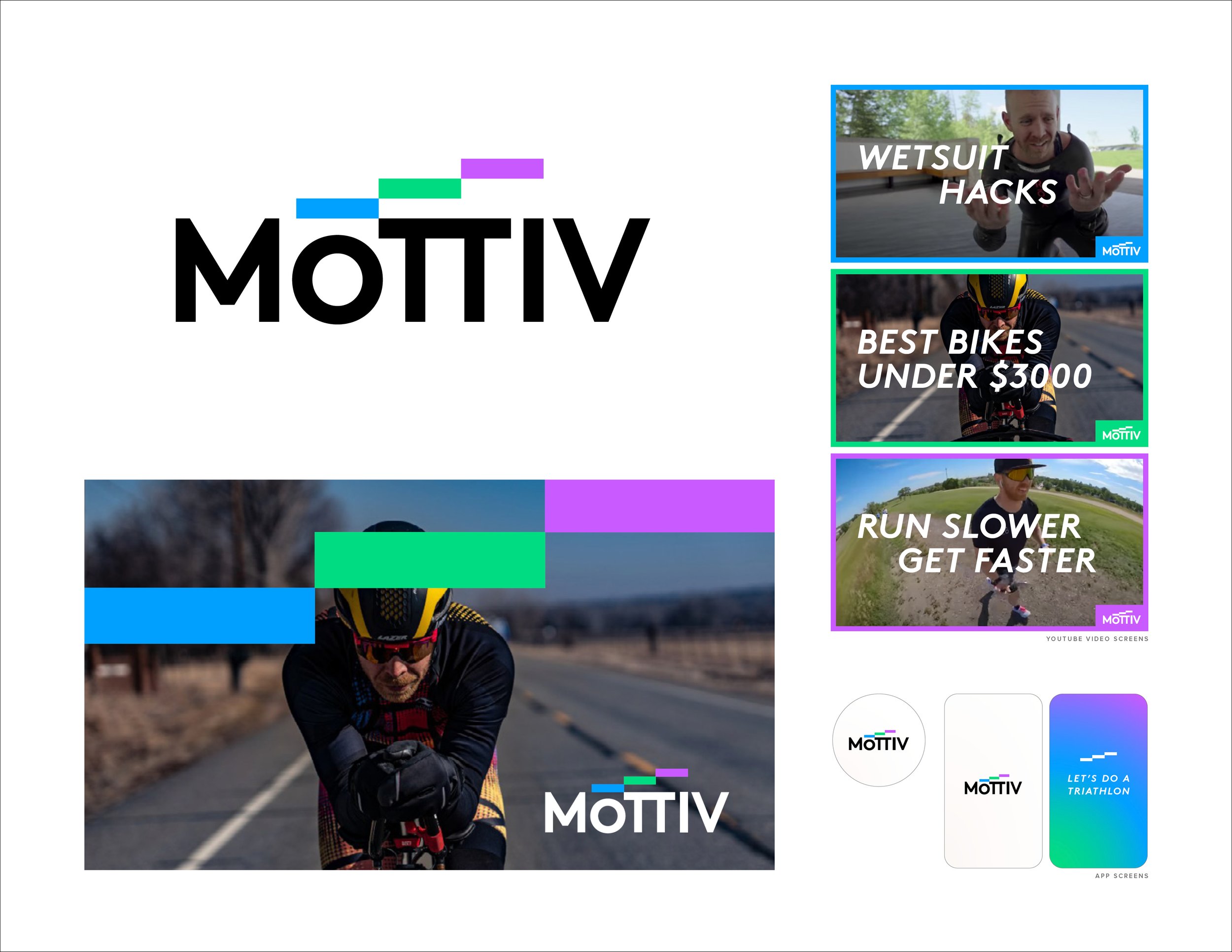
11/11 Client: Mottiv • Agency: Tétro • My Role: Lead Designer An app to help anybody achieve their goals of doing a Triathlon. The app helps keep you motivated to stick to your goals, and continue to create new goals.

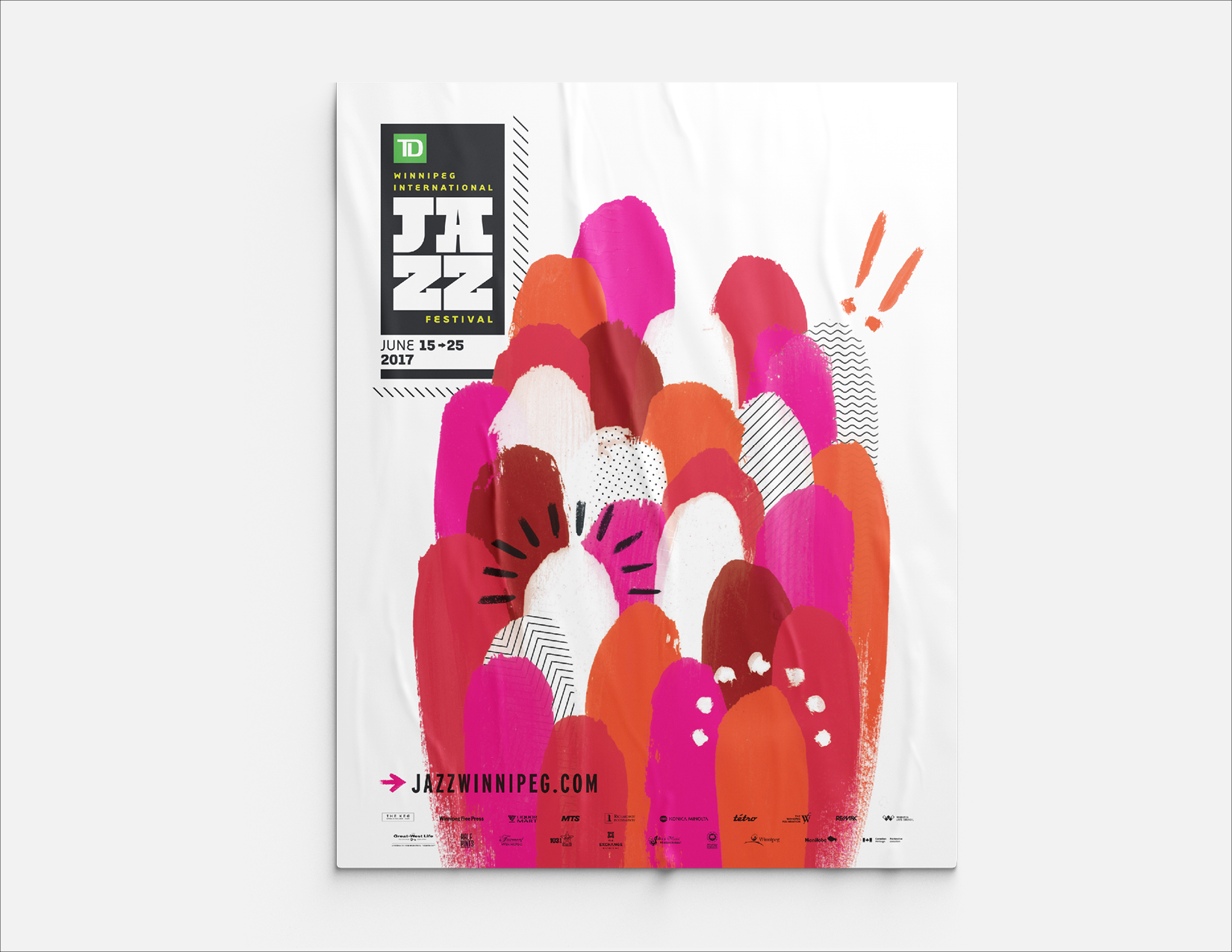
1/9 Client: Winnipeg International Jazz Festival • Agency: Tétro • My Role: Lead Designer A creative for the 2017 festival. The client wanted abstract and eye catching. These posters plastered all around Winnipeg just did that. Inspired by the crowds of unique, diverse people with all the different emotions you feel when listening to Jazz.

2/9 Client: Winnipeg International Jazz Festival • Agency: Tétro • My Role: Lead Designer A creative for the 2018 festival. The client wanted abstract and location. The pattern on the main poster is a birds eye view of the Exchange District where the festival takes place. And the circle represent all the stages and crowds—when the festival is on, it really takes over the whole district.
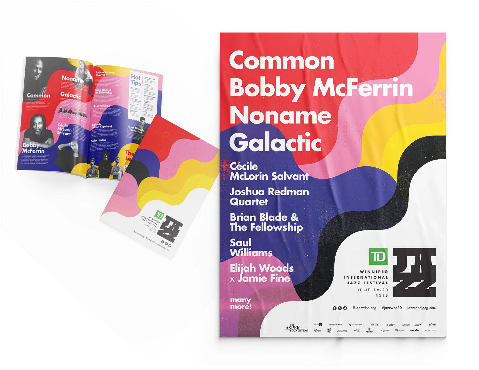
3a/9 Client: Winnipeg International Jazz Festival • Agency: Tétro • My Role: Lead Designer A creative for the 2019 festival. A bold creative representing the different music waves. The simple yet eye catching approach was perfect for a cohesive brand for all the supporting materials. Continued on next slide…

3b/9 Client: Winnipeg International Jazz Festival • Agency: Tétro • My Role: Lead Designer Continued… a look at some of the marketing materials for the 2019 festival.

4/9 Client: Winnipeg International Jazz Festival • Agency: Tétro • My Role: Lead Designer Various gig posters throughout the years for artists performing at Winnipeg International Jazz Festival.
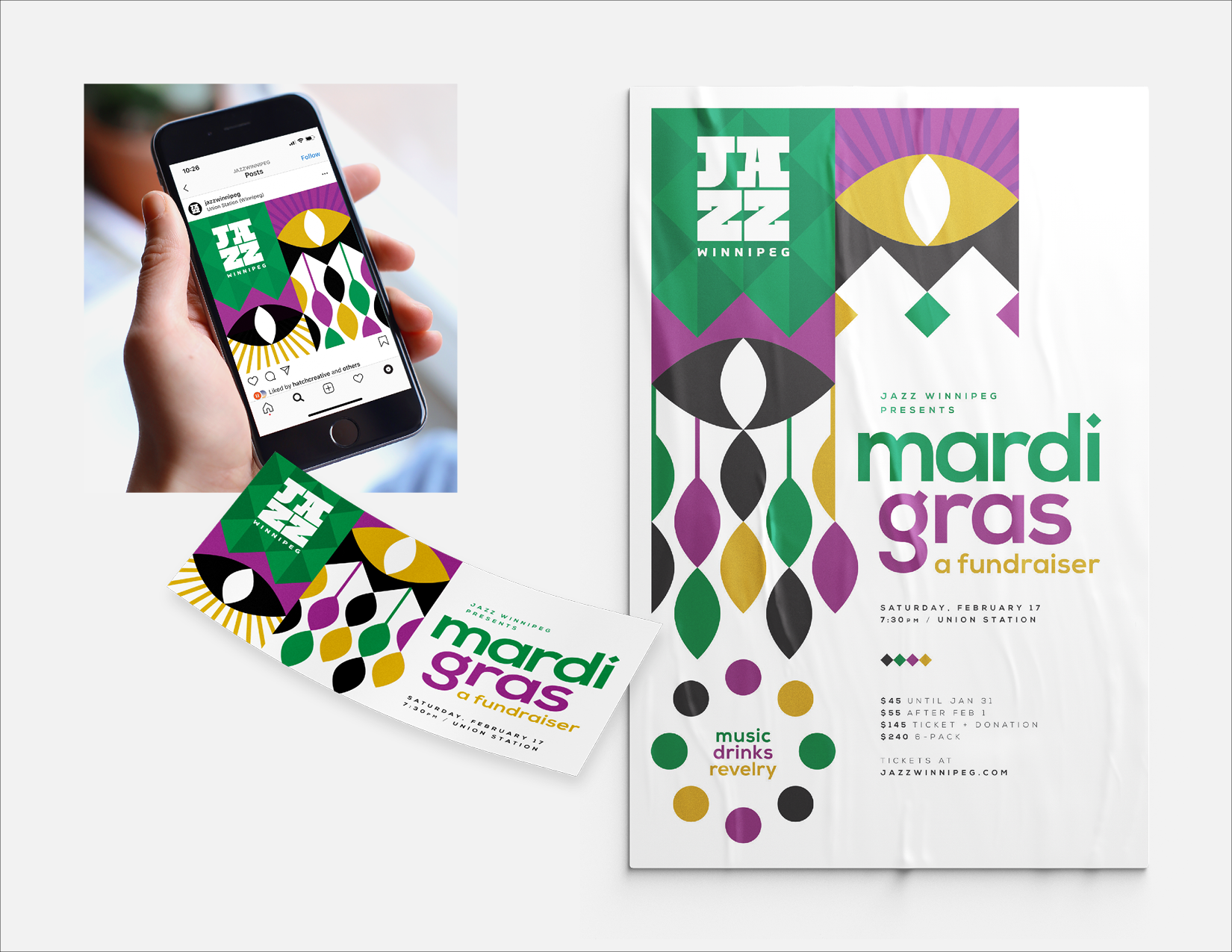
5/9 Client: Winnipeg Jazz • Agency: Tétro • My Role: Lead Designer A fundraiser for the Winnipeg International Jazz Festival. This fundraiser theme was Mardi Gras.
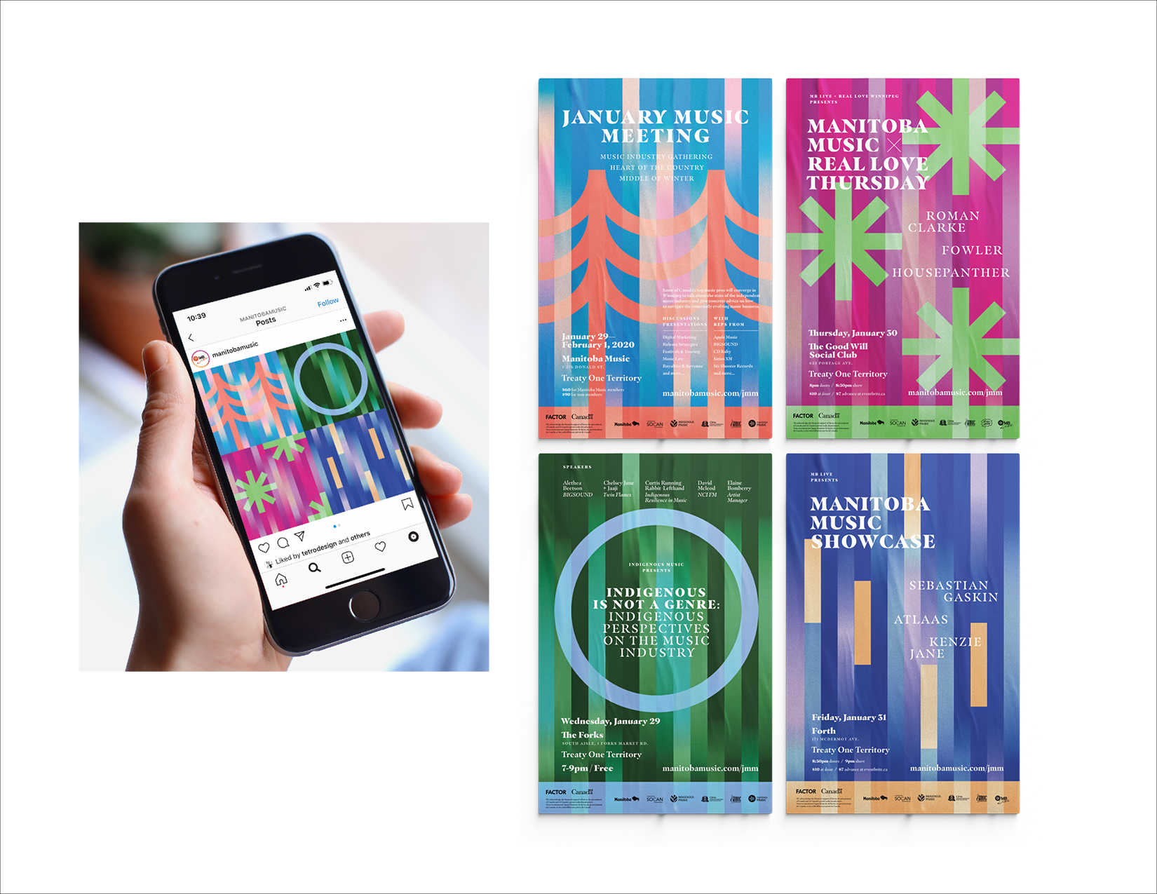
6/9 Client: Manitoba Music • Agency: Tétro • My Role: Lead Designer Serveral events hosted by Manitoba Music, all bringing musicians together, teaching and learning from one another. All four events were to be cohesive and inspired by winter.
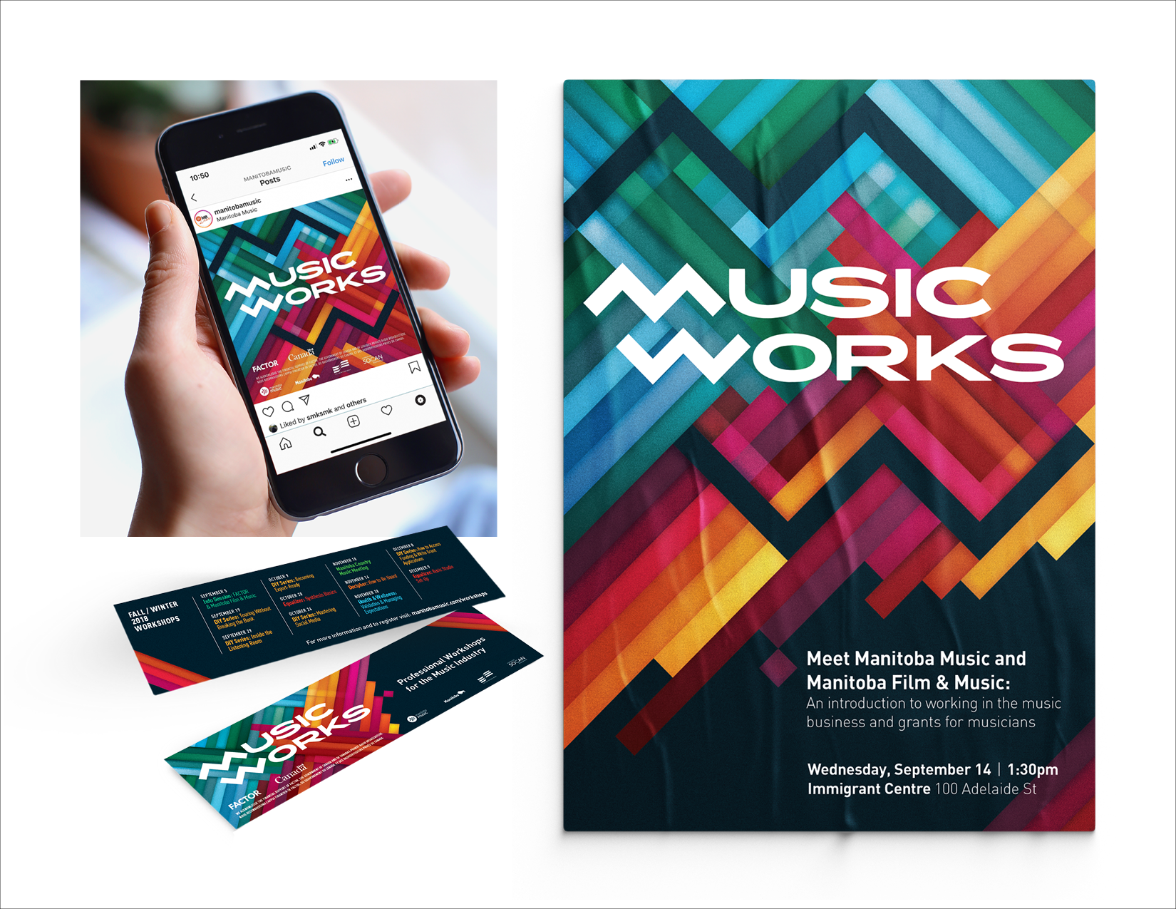
7/9 Client: Manitoba Music • Agency: Tétro • My Role: Lead Designer An ongoing series hosted by Manitoba Music. Each event is to help muscians in their careers learning from other muscians, business owners, financial advisors, etc.

8/9 Client: Manitoba Music • Agency: Tétro • My Role: Lead Designer A yearly event hosted by Manitoba Music where muscians from all around the world and meet at various locations around Canada. This event is full of seminars, concerts and meet & greets.

9/9 Client: Manitoba Music • Agency: Tétro • My Role: Lead Designer An event hosted by Manitoba Music at Festival Du Voyageur. This creative was inspired by Festival Du Voyageur, illustrating big beards/moustaches and canoes travelling down the rivers.

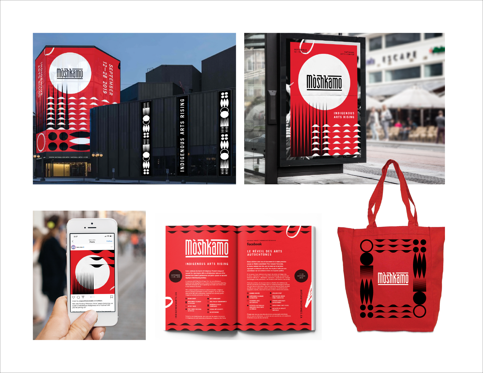
1/7 Client: National Arts Centre Indigenous Theatre • Agency: Tétro • My Role: Lead Designer I worked closely with NAC Indigenous Theatre marketing team to come up with a look and feel for Móshkamo—the event celebrating the beginning of NAC Indigenous Theatre. Just like all the illustration elements, the logo was also hand rendered.

2/7 Client: St.Malo Triathlon • Agency: Tétro • My Role: Lead Designer A yearly triathlon taken place in beautiful St.Malo, Manitoba. This creative was celebrating their 25 years. The client wanted to see a fun bright creative showcasing 25 years and the three sports, fun for all ages.

3/7 Client: St.Malo Triathlon • Agency: Tétro • My Role: Lead Designer A yearly triathlon taken place in beautiful St.Malo, Manitoba. The client wanted to see a modern illustration showcasing the three sports.
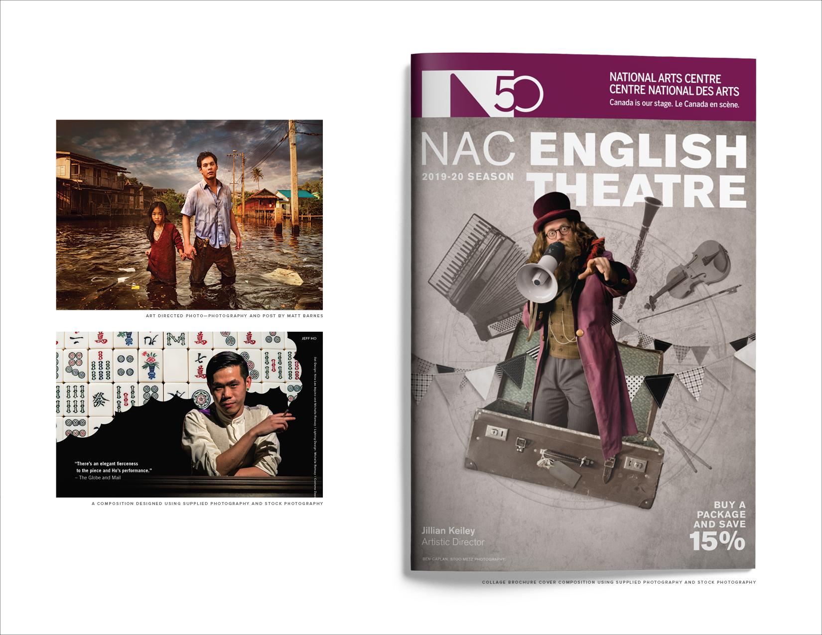
4/7 Client: National Arts Centre • Agency: Tétro • My Role: Lead Designer A glimpse at the NAC English Theatre 2019/2020 year. Showcased here is art directing a photo shoot for a show with Matt Barnes. The other two creatives were using studio shots of existing shows and coming up with an eye-catching creative with a strong story to support them.

5/7 Client: iDE Canada • Agency: Tétro • My Role: Lead Designer iDE Canada creates income and livelihood opportunities in developing countries around the world. This is branding set the look for the 2017 iDE Gala held in Winnipeg inspired by farming.

6/7 Client: iDE Canada • Agency: Tétro • My Role: Lead Designer iDE Canada creates income and livelihood opportunities in developing countries around the world. This is branding set the look for the 2019 iDE Gala held in Winnipeg inspired by a bright future for children.
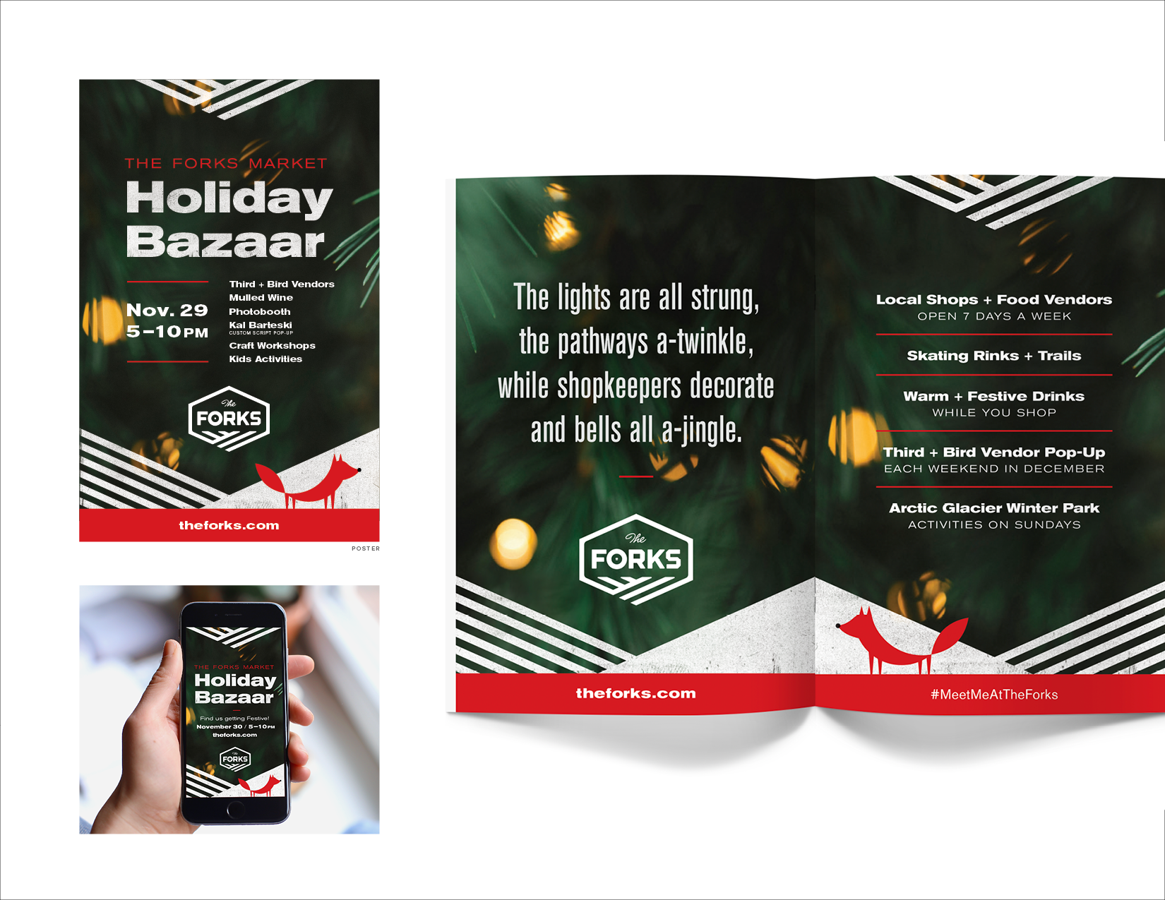
7/7 Client: The Forks • Agency: Tétro • My Role: Lead Designer A Christmas market hosted by The Forks. The client wanted a festive pivot on The Forks brand and to create a little fox character which would translate well to animations and all marketing material.


1/2 Client: Torque Brewing • Agency: Tétro • My Role: Lead Designer A couple label designs for Torque Brewing. Stoffel is inspired by a mischievous honey badger and escape artist. Czech Please is inspired by folk art.
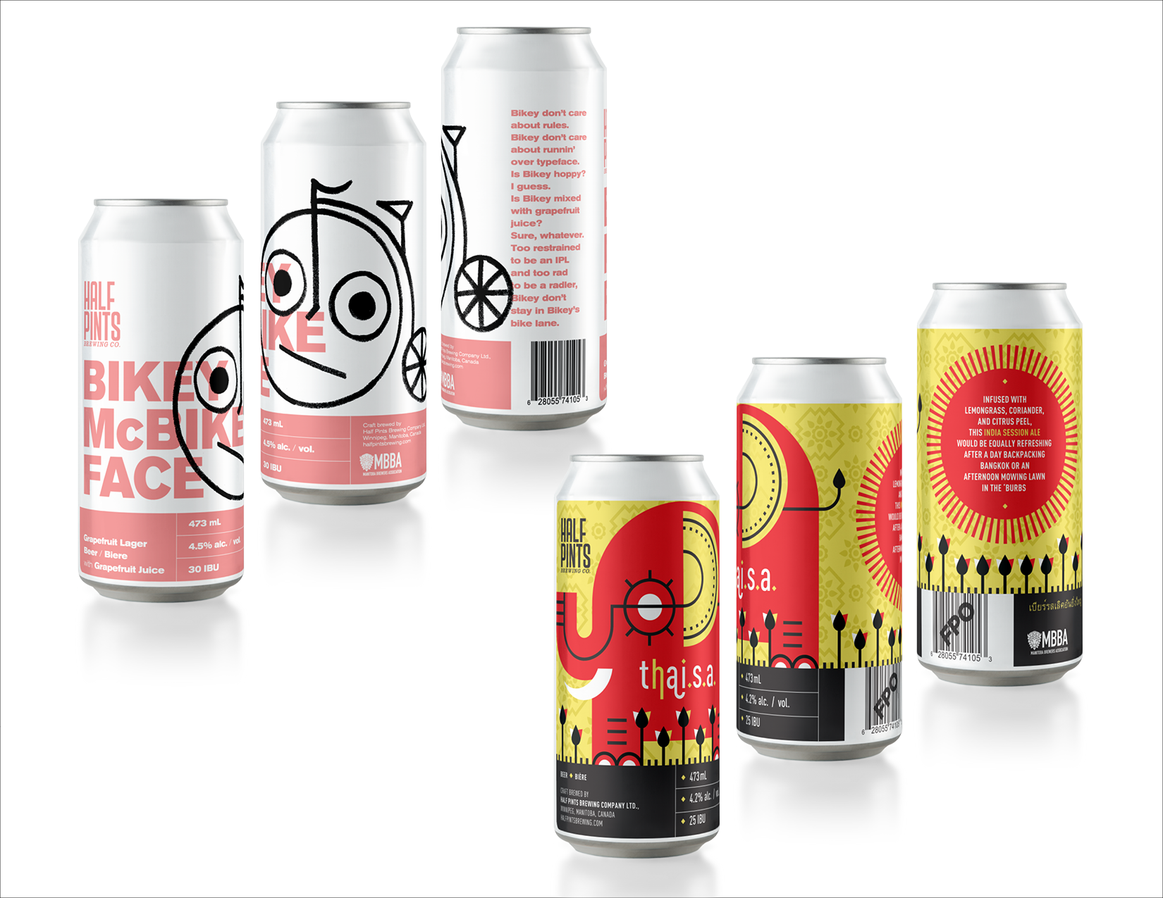
2/2 Client: Half Pints Brewing Co. • Agency: Tétro • My Role: Lead Designer A couple label designs for Half Pints Brewing Co. When given the beer name Bikey McBikeface and full creative freedom, a derpy penny-farthing bike character just seemed like the only way. Thai S.A. Is a thai inspired beer, with the use of gold foil and a modern illustration.

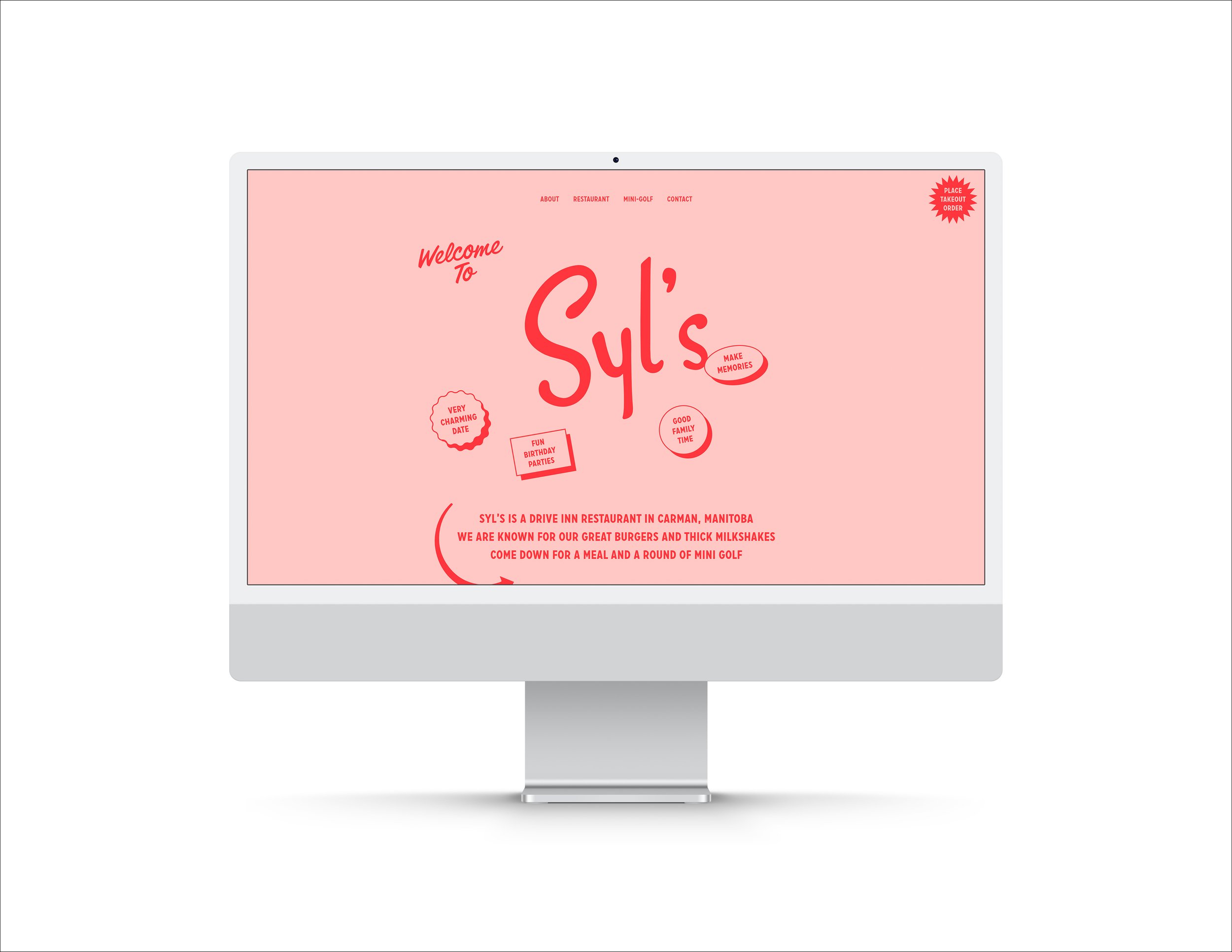
1/6 Client: Syl's Drive Inn • Contracted by Capari • My Role: Web Designer • Development: Capari sylsdriveinn.ca
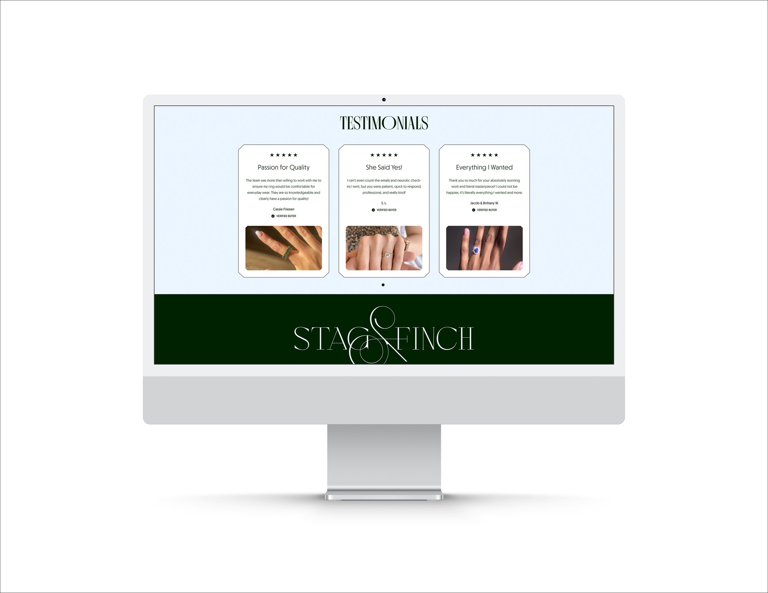
2/6 Client: Stag & Finch • Contracted by Capari • My Role: Web Designer/Branding • Development: Capari stagandfinch.com

3/6 Client: Fortify • Freelance • My Role: Web Designer/Branding • Development: Capari thisisfortify.com Note* I only designed the Home Page, Wellness Page, Intravenous Treatment Page, MadeStrong, Testimonial Page

4/6 Client: Southern Central Cancer Resource • Contracted by Capari • My Role: Web Designer • Development: Capari sccr.mb.ca

5/6 Client: Westwind Realty Inc. • Contracted by Capari • My Role: Web Designer • Development: Capari westwindrealty.ca

6/6 Client: The Property Brokers • Contracted by Capari • My Role: Web Designer • Development: Capari thepropertybrokers.ca